Table of Contents
** Minutes
What is an order confirmation email?
How do order confirmation emails work?
How can an order confirmation email boost customer satisfaction?
How can you improve your order confirmation emails?
The importance of automating the entire transactional experience
Free order confirmation email templates
Don’t forget about the order confirmation page
Key takeaways for leveling up your order confirmation emails
How ShipBob can help you send out better order confirmation emails and streamline shipping
When you think about order confirmation emails, you probably picture a boring email that shares your order receipt.
Usually, these emails don’t have much more to them; there isn’t a lot of color, there are very few pictures, and the copy is strictly informative.
Yes, you need to confirm that the customer’s order is complete and explain that their items are on the way. But since these emails have an open rate of around 60%, there’s an opportunity to do more with your order confirmation emails.
It’s always easier to get repeat business from a customer you already have. Think about upsell and cross-sell opportunities, interesting content you can share, and other ways to delight your customers during the order confirmation experience.
This article will show you how order confirmation emails can help you delight your customers and drive future purchases.
What is an order confirmation email?
Merchants send an order confirmation email to individual customers after they checkout and pay for an order. Both returning and new customers should receive these after every order.
This is a direct result of an action taken by the customer on an ecommerce site.
These emails tend to include the buyer’s order confirmation details, including the date of the order, what they bought, the purchase total, their billing information, the customer’s shipping address, the shipping method, and the estimated delivery date.
The order confirmation email is typically part of a larger post-purchase transactional email flow, which also shares shipping and last-mile delivery updates with customers as their order makes its way to their house.
Not to mention, these transactional flows are only a small part of a grander email marketing strategy, but are equally as important as any other campaign you send, if not more.
How do order confirmation emails work?
Confirmation emails are part of an automated order processing system.
Depending on the platform you’re using, it will make sure all of the correct information and order details are in place before triggering a confirmation email to the customer, including:
- Customer’s name
- Shipping address
- Billing address
- Payment method
- And items to be shipped
This email gets triggered when someone selects the “Confirm Order” or “Place Order” button after following the necessary steps on an ecommerce store.
If the billing information is approved, the order is confirmed and an email will get sent immediately.
How can an order confirmation email boost customer satisfaction?
Order confirmation emails don’t need to be super “salesy” because your customer has already completed a transaction.
But there are still ways you can nurture the relationship with the customer and leave them with a positive impression of your brand. By implementing some practical email content best practices you can excite them with your messaging.
Here are a few examples of how you can do this.
1. Provide assurance to customers
Customers expect an email immediately after they purchase a product. If you don’t send one, the first thought that pops into their head is that they’ve just been scammed. I’m sure we’ve all been there, unfortunately!
Order confirmation emails give customers an electronic trail that their transaction went through properly. This immediately builds trust with them, and they can sit back and relax knowing that they didn’t get scammed.
The email should also outline the next steps and what to expect, such as when the customer should receive the shipping information and order tracking number for the delivery, what to do if the customer needs to return any merchandise, and how they can contact your support team if they need assistance.
2. Help start a long-term relationship with customers
Loyal and returning customers are the lifeblood of your ecommerce business.
Believe it or not, order confirmation emails help start a long-term relationship with customers because they learn to trust your process and they will appreciate the instant communication.
In fact, 64% of customers consider confirmation emails to be the most valuable type of email. Take the mindset of leading with value, and make sure you send customers these emails instantly and with the relevant information they expect.
3. Minimize the need for a customer to contact support.
Order confirmation emails show your customers the next steps and where to go for assistance.
Also, by sending the right information to customers, you’ll minimize the number of support calls or chat tickets because shoppers won’t be left wondering where their order is and when it will arrive.
How can you improve your order confirmation emails?
As we mentioned at the beginning, order confirmation emails have standard information in them. But the point of this article is to show you how you can level up these emails.
There’s always room for improvement to strike the right tone and spice up these emails, especially when so many customers open them.
Partnering with experienced email marketing services providers gives companies the tools and strategy to elevate confirmation emails from basic receipts to powerful engagement drivers.
Here are seven tips to take your order confirmation emails from boring to engaging, plus some order confirmation email examples for inspiration.
1. Send the order confirmation email at the right time
The timeliness of the order confirmation email is crucial.
Your automated inventory management system and email service provider should work together to send an email instantly to someone’s inbox once they complete their purchase.
In fact, somewhere in your ordering system, it should say to customers, “You will receive an order confirmation email upon completion of this order. Please check your spam folder if you haven’t received an email within 5 minutes.”
2. Include important information
All pertinent information regarding the order should go in the confirmation email for easy reference. Make sure to include:
- Order number (for future reference)
- Customer’s name
- Customer’s billing address
- Customer’s shipping address
- Items ordered
- Subtotal of all items
- Final total/amount paid for the items
- Last four numbers of the payment method (credit, debit, ACH)
- When to expect the items/when they will ship
- When/if to expect a second email with a tracking number
- How to contact the merchant if there is an issue
These are the essential parts that every order confirmation email should have. Online pet brand, Chewy, does this well. You can take look at their order confirmation email here.
3. Set clear expectations
Order confirmation emails should set clear expectations for the next steps the customer can expect, such as when the customer can expect to receive shipping information and tracking numbers, how to contact customer service, what to do if the item arrives damaged, and how to arrange a return.
Leaving out critical information means customers get left with unanswered questions, and they might set their own expectations of your brand, which you definitely don’t want.
Eyeglass brand Classic Specs does this well by explaining to customers when the order will ship and how they will communicate with them. All of this is above the fold in the email too, take a look.
4. Get creative with order confirmation emails
Feel free to get creative with your messaging and branding. Despite how many brands send boring order confirmation emails, there’s no rule that says they have to be.
Keep your messaging on brand. For example, your customer just ordered a pallet full of cinder blocks from Acme Bricks. Your order confirmation email can start out with, “Wow, that’s a ton off our backs!”
Additionally, don’t forget about your order confirmation email subject lines.
While it should be clear in the subject line that the email is an order confirmation, you don’t have to be boring about it, either. Instead of saying “Order #958392 confirmed,” try writing copy along the lines of “We got your order!” or “This looks like a good one, Tina!”
5. Drive customers to other channels
Not only do order confirmation emails have high open rates, but they also have an average click rate of 17%. If you’re sending 100 order confirmation emails every day, then that’s about 119 clicks you could be getting on a weekly basis from these emails alone.
Use this opportunity to direct customers to other channels, such as to follow you on social media to learn about new product drops, ask them to leave a review about your shopping experience, or get them to sign up for SMS.
You can also include opt-ins for specials if the customer hasn’t already done so. The point is to try to maintain a point of contact for that customer beyond the initial sale.
Keep in mind the CAN-SPAM law that requires 80% of your transactional email to actually be transactional information. That leaves 20% for your marketing. Basically, just don’t overdo it, okay?
Cosmetics subscription brand Ipsy does a good job of this. In the email, their main call to action is to educate customers on how the self-care starter kit works. At the end they also highlight their social media channels. Take a look at Ipsy’s confirmation email here.
6. Highlight where customers can get support
“Who ya gonna call?”
Unfortunately, not Ghostbusters — even though that would be cool. But in this case, customers do need to know how they can contact your support team or find self-service if they have an issue with their order.
Typical channels include:
- Dedicated support email
- Chatbot
- Phone number
- Social media
- Video chat (in some cases)
Whatever type of support it is that you offer, make it clear to customers in your order confirmation email how they can access it.
Check out this great example from Allbirds.
7. Make sure your order confirmation email is mobile-friendly
60% of consumers check their emails on mobile devices, and they might have made the purchase online in the first place. Knowing this, it’s essential that your order confirmation email design is optimized for customers’ phones and email apps, and not just on desktops.
There’s nothing worse than not being able to click a button, read text, or see an image because the email wasn’t set up for mobile.
And, since you’re trying to build trust with customers at this stage of their journey, you don’t want to send an email that doesn’t look like it was designed and coded properly.
The importance of automating the entire transactional experience
Automating the entire transactional experience creates a more streamlined user experience. Plus, automating repetitive tasks like these will save your team a lot of time and labor costs.
Once your automation is set up, it becomes a completely hands-off approach to communicating with your customers. You can consistently pull in data points from a variety of sources and have personalized emails sent out automatically based on the triggers you set up.
While your workflows run without needing you to manually push any buttons, your team can focus on more important tasks, like strategy and improving the customer experience.
For example, someone paying for an order should trigger an event from your fulfillment provider to start the process of getting the order together, picking out the right packaging, and having the order sent to your customer right away.
On the customer’s end, your automation tool will trigger the transactional email flow, so customers get proper updates throughout the entire process. Then you, as the brand, look like you’re prioritizing their experience by communicating with them often.
The key is to use an automation tool that plays nicely with other tools in your ecommerce tech stack, so your fulfillment data can automatically sync with your ESP, SMS tool, and more.
Ultimately, the goal is to make a well-rounded customer experience, where you can easily pull data points from multiple sources to personalize the way you engage with shoppers.
Free order confirmation email templates
While order confirmation emails should be unique to your brand, most have the same building blocks. Here are some ideas and templates that you can use to create and customize your confirmation emails.
Subject Lines:
- [BUSINESS NAME] Order #[ORDER NUMBER] Confirmed!
- Your order from [BUSINESS NAME] is confirmed!
- Here are you order details from [BUSINESS NAME], [CUSTOMER NAME]
- We got your order, [CUSTOMER NAME]!
- Thanks for shopping with us, [CUSTOMER NAME] — here’s your order info!
- Your order’s in the works, [CUSTOMER NAME]
- Good things are coming your way, [CUSTOMER NAME] (Order Confirmation)
Heading Text:
- Your order is confirmed & on its way!
- Order #[ORDER NUMBER] Confirmed!
- Thank you!
- Good things are in the works
Body Text:
Hi [CUSTOMER NAME],
Thanks so much for shopping with us! We’ve received your order, and will start processing it as soon as we can.
Once your order ships, you will receive a second email with a tracking number. Using that number, you can track your order’s progress here (LINK TO TRACKING PORTAL).
Your estimated delivery date is [DATE OR DATE RANGE].
Order Summary:
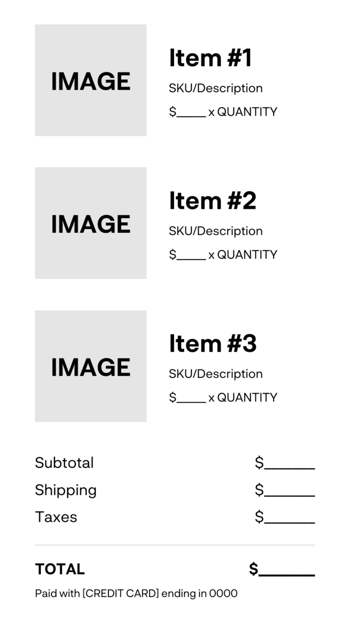
Billed To: [BILLING ADDRESS]
Shipping To: [SHIPPING ADDRESS]
Customer Service Information:
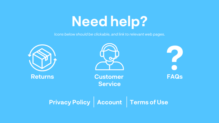
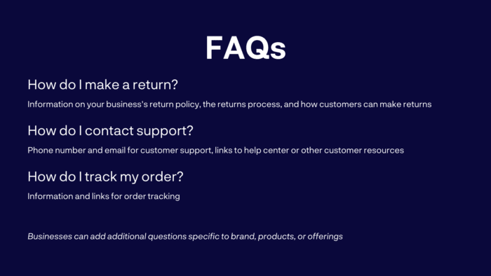
Additional Engagement:
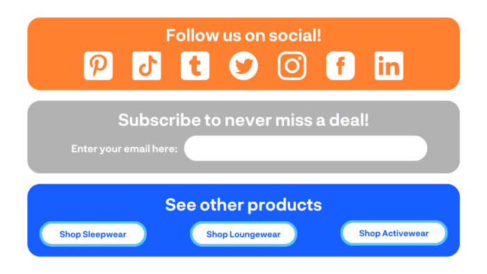
Don’t forget about the order confirmation page
The checkout experience doesn’t end when the customer clicks “Submit”. Ecommerce businesses need to think about the very next place they send customers: the order confirmation page.
Here are some tips for creating an order confirmation page that is both eye-catching and effective.
Confirm the transaction
First and foremost, an order confirmation page should reassure the customer, and make it clear that your business has recognized and received their order.
Typically, business do this by featuring a thank-you message of some kind, as well as information on next steps and what the customer should expect going forward.
For example, H&M’s order confirmation page includes a prominent thank-you and text that tells the customer their order is in progress, and that they should check their email for further order confirmation.
Summarize the order (incl order no.)
Meticulous shippers will want confirmation that they ordered the items they intended to. So if at all possible, your store’s order confirmation page should include a summary of the customer’s order.
Ideally, this summary will include:
- Every item purchased
- A picture of that item
- The quantity of that item purchased
- The amount paid for each item
Even more importantly, the order confirmation page must include the order number. This enables customers to track their order, and gives them proof of purchase in case of fulfillment or shipping mistakes.
In this example from Beekeeper Supplies, both order number and the order summary are displayed prominently:
Highlight the expected delivery date
As soon as they place their order, customers want to know when they can expect to get it.
By providing an estimated delivery date, a business can reduce the number of questions they must field regarding delivery time. Even a rough estimate can go a long way, especially if customers also receive tracking information and can check on their order as it progresses through fulfillment and shipping.
This order confirmation page from Coffeefy makes the expected delivery date its focal point. It also points out to the customer where their order is in the fulfillment process, and gives the customer the chance to view more tracking details.
Gently encourage account creation
Beyond the necessary information, there are other value-adds that you can include on your order confirmation page to drive future engagement.
Prompting the customer to create an account can open the door to both pre and post-purchase communication and marketing opportunities down the road, as long as it is not required, and does not displace any information pertinent to the order.
Offer a discount on the next order
As one of the only moments where you have your customer’s undivided attention, the order confirmation page is a great stage for your best promotions.
Including special deals or discount codes on your confirmation pages may incentivize customers to purchase from you again, which increases conversion rates and boosts sales.
Keep it simple
While it’s tempting to pack as much information in as possible, it’s always best to keep order confirmation pages short and sweet.
If an order confirmation page is too long, customers may get frustrated, lose interest, and feel disinclined to buy from you again. To prevent this, make sure to highlight the most important information first, present it clearly, and test it before going live.
Key takeaways for leveling up your order confirmation emails
Order confirmation emails are an essential part of the online shopping experience.
If retailers don’t send them, their customers won’t know what’s happening with their order and that creates tension.
Yet, if retailers do send them but the information is incorrect, then customers will feel let down and they will probably look for a different brand next time.
Because of this, brands must do everything they can to make the entire shopping experience enjoyable for customers, from browsing the web store to getting the package in hand.
The best way to achieve this is by keeping inventory management, shipping and fulfillment, and order management under one roof to more effectively manage orders than those relying on multiple different providers.
Additionally, reducing the impact of human error by working with an automation tool to streamline these processes can help.
In the end, it’s about maintaining customer expectations — and even better if you can exceed them.
How ShipBob can help you send out better order confirmation emails and streamline shipping
ShipBob knows how important confirmation emails are, that’s why our order confirmation solution helps ecommerce companies provide accurate order info to meets customer expectations and improve customer satisfaction.
Once an order is fulfilled by ShipBob, a unique tracking number is uploaded to the shipment details page that links to the carrier’s website. This allows you to track the progress of the shipment from ShipBob FC to the customer. Easy as that!
With ShipBob, you can also subscribe to order updates to have tracking sent directly to your email.
Plus, with the Alloy and ShipBob integration, you can build customized workflows between any of your favorite ecommerce tools (i.e. Shopify, BigCommerce, MailChimp, etc.). Cut back on time you spend manually updating workflows by connecting this integration.
Ready to streamline your shipping? Get started with ShipBob by requesting a fulfillment quote below.
Order confirmation email FAQs
Find answers to frequently asked questions about order confirmation emails.
What is an order confirmation email?
It’s an automatic transactional email a customer receives after placing an order.
Is an order confirmation email a receipt?
Yes, but it’s not the only receipt. A customer should be able to log into the ordering system to see the details of the order after they place and pay for it. Also, order confirmation emails are more than just a receipt — it’s about showing customers you received their order and defining the expectations around when they will receive it.
How do I know if my order confirmation email is correct?
A customer should be able to double-check the details of the order confirmation email with the ordering system itself after logging in. All of the details should match, and the email should come from a familiar retailer shortly after the customer placed the order.
What does an order confirmation email usually include?
An order confirmation email should include important details related to the customer’s order, such as:
- Customer’s name
- Customer’s shipping address
- Customer’s billing address
- Items ordered
- Amount paid
- Last four numbers of the payment method
- Where and how to contact customer support
