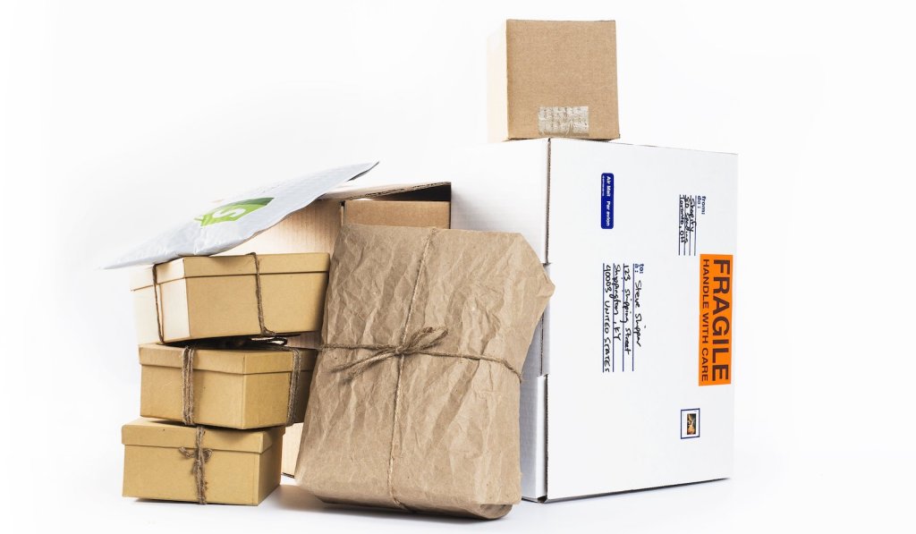
Looking for some tips on what to consider when designing custom packaging for your orders? You’re in the right place.
Note: When we say packaging, we’re talking about the boxes, paper tubes, bags, tissue, package inserts, and stickers that you use for your orders, not about greek yogurt containers or beer bottles, although there are some pretty amazing designs for those.
5 tips for designing custom t-shirt packaging
Here are the top considerations when designing custom packaging.
1. Think about how the package is received
Most likely, if you’re shipping a package to someone, it will be left on their doorstep. So you should be thinking about what you can do to make the visual impact appealing while making sure that the box still sits well on a front porch.
It would certainly be exciting to receive something packaged in an octagonal box, but what the heck is your customer going to do with all of that cardboard, and wouldn’t it have been better to just ship your goods in a bio-mailer? With packaging design, you have to think first and foremost about the needs of the person receiving it.
In that vein, think about what is going to be put on your package: you need to include space for shipping details, the label that gets slapped on to track the package, and possibly a few more things (hello, fragile stickers!).
Making sure that you invest your design resources at the right level is as important as making sure your designs look good. It doesn’t matter if you have the most beautiful artwork on your box; we can guarantee a shipping barcode and shipping label will cover up some of the best bits!
2. Keep it practical
This brings us to the practicality of your packaging. Every architect knows that, with design, there is always a battle between form and function. Form is the aesthetic appeal of what you’re creating, and function is how well it does its job.
Did the package arrive undamaged? That should be priority numero uno because let’s face it, the prettiest, most eye-catching design in the world isn’t going to make up for the fact that the candle you shipped was stomped to pieces because the delivery driver had to stack 13 other boxes on top of yours. So think about function first, form second.
If you can sneak in a cheeky little piece of design work that adds flair to your distinctive packaging, go for it! As a prime example, the shoe company Allbirds created a rectangular box that unfolds to have two smaller boxes attached — one for each shoe! If that isn’t the perfect balance of form and function then we don’t know what is.
3. Over-designing minimizes impact
This point is crucial. You want to make an impact, but sometimes over-designing can end up hurting, not helping. You know you’ve done too much when at the end of the day you look at the tissue wrapped around the custom t-shirt you’re shipping, and have no idea what kind of brand you are.
Stick to strong visual elements that carry your message through, and use pieces of flair like a wacky sticker or a cool postcard inside the package to accentuate your goods. Over-designing is cluttered. Under-designing is boring. But the perfect design will be just right.
4. Typography vs. image-based design
On the design side of things, what are you going to use to represent your brand? Some advice for keeping it simple: use typography to your advantage. We’re not saying that imagery is a bad thing; quite the contrary, in fact! But imagery is difficult to get right. And when it comes to your brand identity, keeping your logo front and center is important.
To start with, make sure your logo can translate well to black and white, as well as be easily readable at multiple sizes so that it can be used across mediums. For example, printing it on your box and your wrapping, then emboss it on the letterhead that you use for a custom note thanking your customers. Remind them where this great stuff came from!
5. Using color effectively
Finally, we’ll speak a bit to color. As any good designer will tell you, color can be tricky and doesn’t always turn out exactly how you imagined. Take it from us at noissue: we print using a color-matching system that guarantees that the color you use for your design is the exact color that gets custom printed.
That aside, you will typically be restricted in what colors you can use in your design, which makes them all the more important to get right! Use colors that match your brand or promote your concept. Once you’ve nailed down your brand image, it’s time to start getting creative with your packaging designs — why not go with pastels for your Easter shipments or red, white, and green for your holiday ones?
Using color effectively is a great way to impress customers and leave something a little more exciting on their doorstep.
Overall, keep your t-shirt packaging simple, keep your logo front and center, and make sure you’re thinking practically. These tips should set you up well for your design and help make sure that you’re not cluttering your messaging by doing too much.
With all of the packaging customization options that exist nowadays, you have a lot to choose from. So while getting it right can prove difficult, it will be all the more rewarding when you do!
Shipping custom packaging
If you’re shipping orders at scale, you need a reliable fulfillment partner. ShipBob helps ecommerce brands of all sizes store inventory, kit orders, and ship items in custom branded boxes. Learn if we are a good fit for your brand and requesting a pricing quote at the link below.


